Banner Designing is Crucial for Marketing
Creating a website can be challenging at times. Even the most seasoned website design pros can encounter obstacles in their careers.
However, website banners are a significant component of the whole equation. A company does not have the required call to action that it has to have to get people actively engaged in the goods if it does not have banners like these.
Working with a local website design service can assist a company in being on top of its game. Let’s take a more in-depth look at all the methods that website design specialists might assist with.

So, What Exactly Are Banner Advertisements?
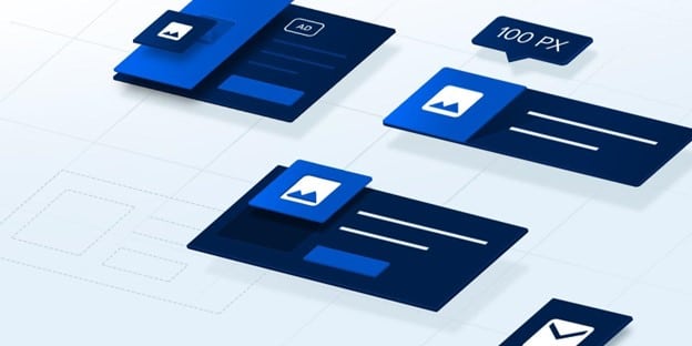
The layout of banners, among the most often utilized aspects of advertising in today’s internet world, can take on various forms and can be found in a wide range of sizes.
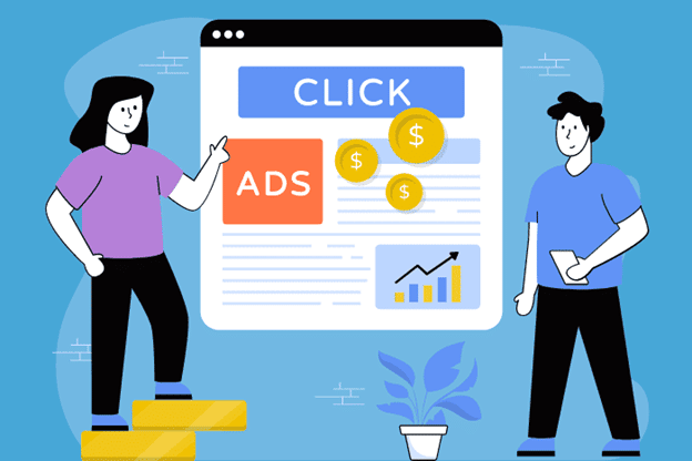
The primary objective of web banner design is to provide advertisements that are as clickable as humanly possible. Banner ads are pictures of advertisements that are placed on websites.
These banners often highlight a particular product or brand and connect to the advertiser’s website. Statista anticipated that expenditure on advertisements within the Banner Advertising industry would reach $155.00 billion in 2022.
Because they are an inexpensive, quantifiable, and successful means to promote brand recognition, most businesses employ them in some capacity or another.
Mobile would be responsible for generating 167.80 billion dollars worth of total advertising expenditure in the Banner Advertising market in 2027.
Don’t Forget “Above the Fold”
In general, tips for homepage banners or homepage design can’t be discussed here without including the fold in some capacity.
The top half of a newspaper, also known as the material that is visible above the fold of the paper, is referred to as “above the fold” in the context of newspapers.
This idea has been around for centuries since the very first printing press was invented, and it is still relevant in the digital marketing age that we live in today.
In a similar vein, when marketers refer to “above the fold,” they are referring to the portion of a website that is accessible to the user without the need for the user to scroll down.
It is necessary to include the homepage’s primary banner above the fold, the menu, the header, and at least one “call to action” for the visitor.
● Significance of Above the Fold
The most significant material should always be shown at the top of a page. Is there a new explanation for this? When connections were slow in the early days of the Internet, many people didn’t bother to read anything beyond the fold since it would take too long for the material below to load.
The contemporary Internet “surfer’s” short attention span and the need to get the most out of every page in seconds are the primary causes of this phenomenon. It’s not difficult for today’s tech-savvy users to scroll down a website, but the material that loads initially is what they focus on.
As a result, this website section is responsible for leading the user along the sales funnel. The initial fold should be natural and attract the user, encouraging him to continue exploring and making a purchase decision.
It’s also supported by the results of heat and scroll maps. According to most people, the typical fold is the most popular element of a website, with the most mouse clicks done on it when visitors first arrive.
Users can leave your website totally if you don’t meet their expectations within five seconds, which is a terrible reality. If they go to search results, they’ll discover your competition.
If their website gives the customer exactly what he wants to see, then the user will remain on that page and ultimately utilize your competitor’s services or goods.
Advertising Tips for Optimizing Your Website Banner Design
Take a look at some of the best marketing tips for optimizing your homepage banner design:
Tip 1: Use Creatopy’s Banner Maker
Using the online banner creator provided by Creatopy, you can quickly design and personalize banners that speak directly to your target audience.
Maintaining your brand’s consistency via banners that appear professional and are available in just a few clicks will allow you to optimize the creation and distribution of your advertisements across all of the main social media platforms and display ad networks.
Maintain complete control over the development of your banners by doing everything in-house. Using our custom banner creator, you can personalize the look of your web banner down to the tiniest of details while also automating the creation of your advertisements.
All of this can be done while working side by side with other members of your team using the Creatopy Banner Customizer!
Tip 2: Use Better, Clear Headlines in Your Banner
Your homepage banner must have a clear, concise title that explains what your business does. Consider the importance of providing new visitors with information on the specifics of your website and the products and services your business provides.
Returning visitors will not need this, but it is still an important consideration. Use relevant keywords if you can, so if you’re offering logistics services, include the phrase “logistic services” in your meta description. It’s obvious right away.
When writing a headline, please don’t include your company’s motto since it’s not detailed enough in most circumstances. In other words, what precisely does the phrase “We produce brilliance” imply in terms of the services or goods you provide? Modern browsers are more inclined to abandon a site that doesn’t perform correctly, according to research.
Tip 3: Optimize Your Homepage for Mobile Usage
Customers are increasingly adopting mobile devices in their everyday lives for various functions, from listening to music to shopping for necessities, since they are so easy to take everywhere.
It’s hardly unexpected, considering that 54.4% of all online traffic will be generated by mobile devices by 2022. Mobile-friendly e-commerce sites are vital, particularly for banner adverts, since that proportion might include your prospective customers.
Unless visitors to your landing page pinch and zoom their cellphones to view your website banner if it is not mobile-optimized, no one who visits your page will likely notice it.
Tip 4: Select Appropriate Colors
It’s important to note that colors are subjective and have various meanings in different cultures. When choosing colors, keep in mind who you’re designing for. In the West, certain colors tend to elicit certain feelings in people.
- Blue – A sense of security, confidence, maturity, serenity, and intelligence are all attributes of masculinity, as are the attributes of formality, coolness, and formality. More than half of all logos include the color blue.
- Green – The importance of a healthy and vibrant body and mind as well as the preservation of the environment for future generations. It’s also quite pleasing to the eye.
- Yellow – Sunshine, cheer, and goodwill are the order of the day. Yellow is a standout color that conveys a reasonably priced sense of vitality and youth.
- Orange – Feelings of fun and levity. Orange is a terrific color for a call-to-action button since it stands out from the crowd and oozes vitality.
- Red – Intense feelings of rage, fury, and, of course, adoration. Most people are drawn to this intense shade; however, it should only be used sparingly. You should avoid red if trying to achieve a classic, mature, or serious appearance.
And since we’re talking about colors, here are six PowerPoint templates to spice up your presentation!
Tip 5: Think About the Homepage Banner Size
We’ve previously discussed the importance of attention to picture resolution, size, and quality. The size of your banner picture will affect the amount of material shown above the page’s fold. On the initial fold, you’ll be able to display a smaller amount of content if your page is larger.
To provide room to tantalize your items or services, you may want to shrink your banner size from time to time, particularly if your business offers a wide range of goods and services to customers.
Tip 6: Include Call-To-Action (CTA)
Having a banner on your website is pointless if no one clicks on it to take action. CTA buttons should be prominently displayed to prevent this. You can get their attention and get them to take action by doing so
In our situation, we chose a color for the CTA button that stands out from the rest of the design. Hovering users will see a little movement of the button, which will nudge them to click on the CTA.
Tip 7: Present Social Proofs
A psychological and sociological notion known as social proof relates to individuals following other people’s activities. For example, if the majority does something, it is more probable that others will do the same.
It is a good idea to look for social evidence in the form of endorsements, endorsements from prominent people, testimonials, and certificates.
As a result, social proof can be used in banner advertising and digital marketing. Adding testimonials to your website banners is an excellent demonstration of your trustworthiness.
If people see favorable feedback testimonies on your banner, they can see your brand as more credible and trustworthy. Since 2007, online comments from other customers have increased by 7 percent, making them the third most trustworthy source for product information, according to a new survey.

Improve Your Banner Ads Now!
Pay attention to the needs of the user. Do not only display what you assume your consumers are searching for when you target your customers.
Just because your traffic and conversions are “fine” doesn’t mean you should stop enhancing your banners. To increase sales, use social evidence and authority. You can also read these tips to create some engaging social media videos to further elevate your business to the next level.
Identify the ideal amount of times a user encounters your banner. Create a variety of ad kinds for each step of the sales process.
Writer’s Bio
Tayyab is a diction enthusiast and an SEO buff with a CS background. He’s been serving the SAAS & PAAS world for the last five years. Let’s connect on LinkedIn.


